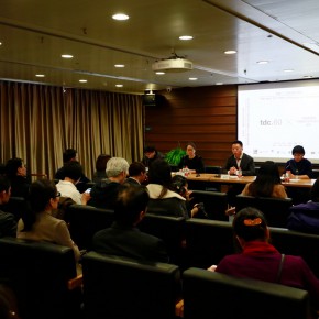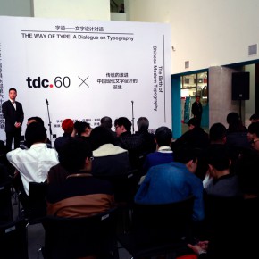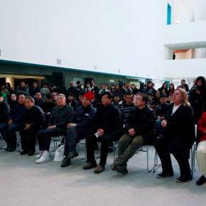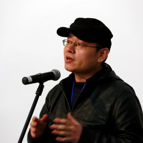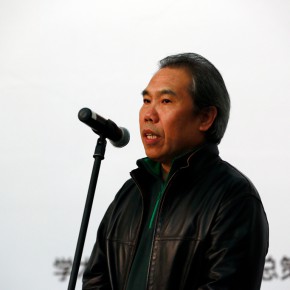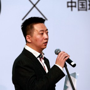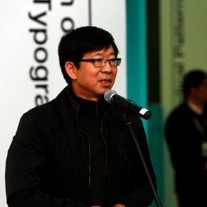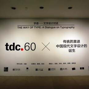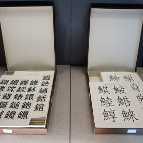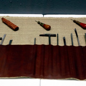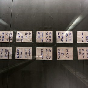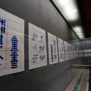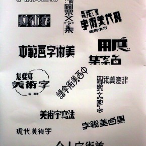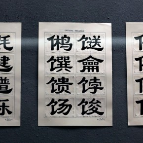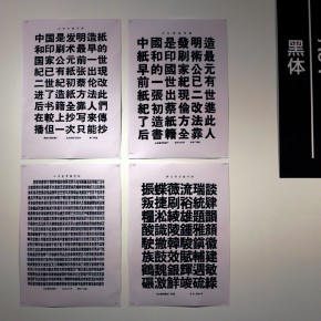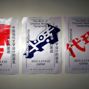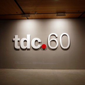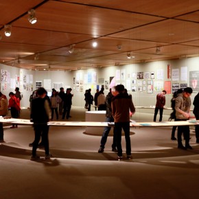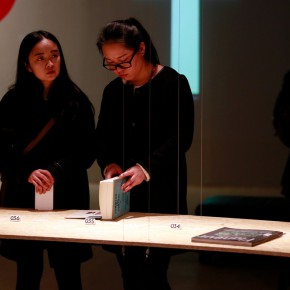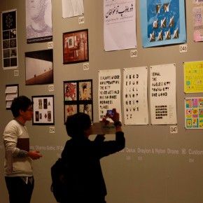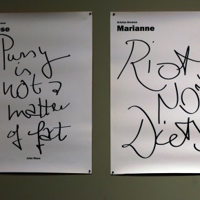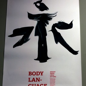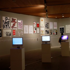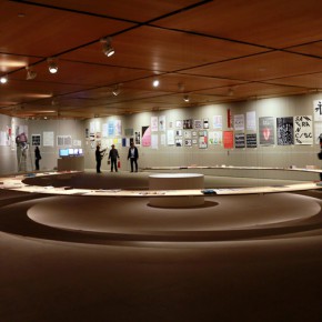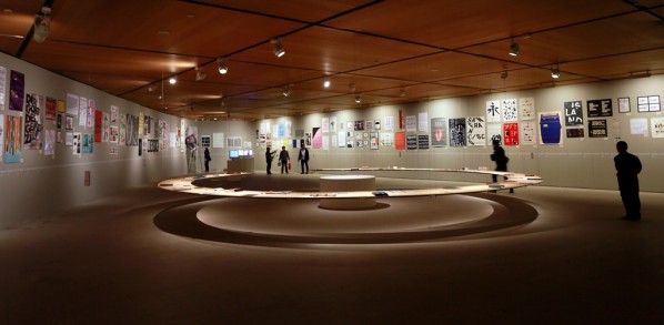
On March 17, 2015, “The Way of Type: A Dialogue on Typography” was unveiled at CAFA Art Museum, the exhibition is jointly organized by the School of Design, CAFA, CAFAM, and the library, and Wang Min, Dean of the School of Design, CAFA serves as the academic director, Tang Bin and Liu Zhao serve as the chief curators, through two parallel exhibitions of the “60th New York Type Directors Club, TDC World Tour, Beijing” and “The Birth of Chinese Modern Typography”, to show the visual beauty of Chinese and Western typography.
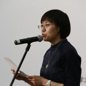
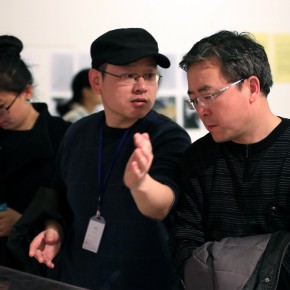
Type is the cornerstone of the development of civilization, and a vein of cultural heritage, with the development of the era, typography becomes an important topic in the field of design, so the School of Design, CAFA has done a lot of research and cataloguing in terms of typography, and through a series of activities such as exhibitions and workshops to inform the audience about the relationships between the type, culture and society. At the exhibition press conference, Tang Bin, Deputy Director of CAFAM said that, CAFAM arranged the exhibition on the basis of the academy discipline in architecture and the art museum exhibition structure, and the two parallel exhibitions highlighted the contrast between the Chinese and Western styles, which is of special significance. Wang Shaojun, Deputy Party Secretary of CAFA stressed that the exhibition represented the sharpness of the development of discipline of the School of Design, CAFA, also affirmed the significance of “dialogue” in the event, he said he was unfamiliar with typography too, so the exhibition was not only a dialogue between China and the West, but also promoting the dialogue between different specialties of the academy.
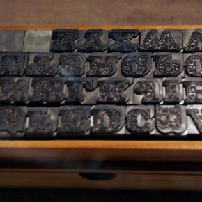
“The Way of Type: A Dialogue on Typography” series of academic activitiesis generated following the “60th New York Type Directors Club, TDC World Tour” landed CAFA Art Museum. New York Type Directors Club, TDC was established in 1946, to be the professional organization of typography, aimed at promoting the application and innovation of typography in the fields of contemporary printing, screen and other categories of media. The winning work of the design competition represents the highest level of the present Latin typography. It is the 60th anniversaryof the exhibition, there is a saying in China: 60 years is a cycle, so it hopes that the exhibition turns into a symbol, in order to trigger designers and the educators, paying attention to typography, with feedback onthe practice of Chinese typography. It does not only showcase the charm of Western typography, but also combs through the development of Chinese typography, so “Traditional Radical - The Birth of Chinese Modern Typography” exhibition emerges as the times require.
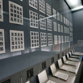
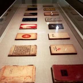
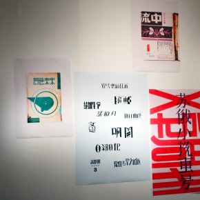
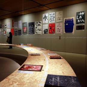
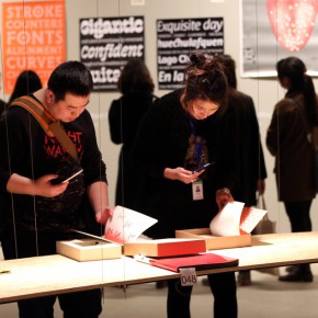
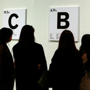
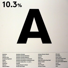
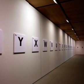
For the exhibition structure, Wu Fan, curator of the TDC tour exhibition Beijing station said, the exhibition focused on guiding the audience in breaking through the cultural gaps to understand Latin and Western typography in the context of a Chinese structure. The exhibition is divided into two parts, featuring more than 200 works, including 24 award-winning works of typography. The exhibition uses the alphabet to classify the work, collecting the results for statistics. It also breaks through the style of arranging as centered on the medium and work, taking the ontology of “type” as the protagonist and principal clue of the show, and the exhibition restores the display environment of the work, so it chooses a wall to display the work of the poster, while it chooses a desktop display for the book designs. In addition, it edits and publishes a Chinese and English bilingual catalog, which is the crystallization of the organizing and research of the event, and it is in the process of printing now.
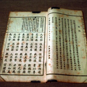
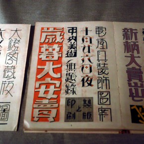
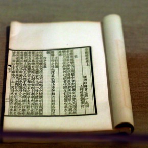
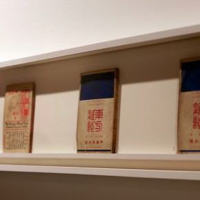
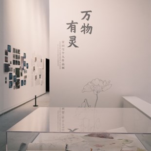
“Traditional Radical - The Birth of Chinese Modern Typography” exhibition is starting from the design discipline perspective, and carries a literature review and theoretical deduction to Chinese modern typography in the 20th century. How does Chinese modernity germinate in typography? Through a series of literature based on the context of practice, the exhibition turns the fragments of evidence into a complete clue, which does not only contain the position of typographers but also includes forgotten early masters, art workers, literati loving to design, as well as more unknown evidence.
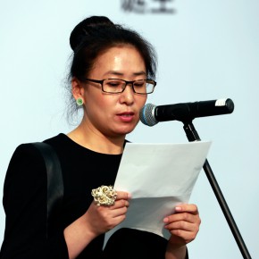
Hanyi Fonts is the co-organizer of the exhibition, providing a large number of precious hand-writing types in this exhibition, Chen Yan, Chairman of Beijing Hanyi Keyin Information Technology Co., Ltd. announced the official start of “The 2nd Star of the Font Design Competition” at the opening of the exhibition. The exhibition continues to April 10, and it will launch a series of seminars, workshops and parent-child activities during the exhibition.
Text and photo by Zhang Wenzhi/CAFA ART INFO
Translated by Chen Peihua and edited by Sue/CAFA ART INFO


